Weekly AI API status email template
When your product depends on third-party LLM APIs, silence between incidents is not the same as reliability. A weekly status email gives your team, and your stakeholders, a predictable, data-backed snapshot of how OpenAI, OpenRouter, and other providers actually performed over the past seven days. This article provides a ready-to-use template, explains every section you should include, and shows how to automate the whole process so it takes minutes instead of an hour every Monday morning.

Photo by Andrew Neel from Pexels
When your product depends on third-party LLM APIs, silence between incidents is not the same as reliability. A weekly status email gives your team, and your stakeholders, a predictable, data-backed snapshot of how OpenAI, OpenRouter, and other providers actually performed over the past seven days. This article provides a ready-to-use template, explains every section you should include, and shows how to automate the whole process so it takes minutes instead of an hour every Monday morning.
TL;DR
- A weekly AI API status email keeps engineering, product, and leadership aligned on provider health without requiring everyone to check dashboards.
- The template covers five core sections: executive summary, latency trends, regional breakdown, incident log, and action items.
- Standardized writing conventions matter more than extra fields, keep each section to two or three sentences plus a data table or bullet list.
- Automation via monitoring tools like Observinio can pre-fill latency baselines, regional variance data, and degradation events directly into your template.
- Sending the email at a fixed cadence (e.g., Monday 09:00 UTC) builds trust and catches slow regressions that real-time alerts miss.
Why a weekly status email still matters

Real-time alerts are essential, but they only tell you about acute spikes. A weekly summary serves a different purpose: it surfaces slow-moving trends that no single alert would fire on. Consider a scenario where your median TTFB to OpenAI's gpt-4o endpoint drifts upward by 40 ms each week across your EU-West region. No individual probe crosses your degradation threshold, yet after a month your p95 latency has grown by 160 ms, enough to noticeably degrade chat UX for European users.
A weekly email catches that drift because it forces someone to compare this week's numbers against last week's baseline. It also creates an audit trail. When a VP asks "has our AI backend gotten slower?" you can point to a dated email thread instead of scrambling to pull ad-hoc queries.
Who should receive it
Not everyone needs the same depth. A practical distribution list looks like this:
- Engineering / ML platform team, full email with regional breakdowns and raw latency tables.
- Product managers, executive summary plus incident log; they care about user-facing impact.
- Leadership / stakeholders, executive summary only, forwarded or pasted into a Slack digest.
Anatomy of the template

Below is the complete template broken into its five required sections. Each section includes guidance on what to write and an example snippet you can copy into your email client, wiki, or automation script.
Section 1: Executive summary
This is the only part every recipient will read. Keep it to three sentences maximum: overall status, biggest change from last week, and one forward-looking note.
Example:
Week of 2026-08-03 → 2026-08-09
Overall AI API health: Good. Median TTFB across all monitored endpoints improved by 6% week-over-week. One degradation event on OpenRouter (Thursday, 12:04–12:47 UTC) affected Asia-Southeast regions. No action items carry over into next week.
Section 2: Latency trends table
Present a simple table comparing this week's key percentiles against the previous week. At minimum, include median (p50) and p95 for each provider you depend on. If you monitor from multiple regions via a tool like Observinio, add a "worst region" column so readers immediately see where the pain is.
| Provider | Endpoint | p50 this week | p50 last week | Δ | p95 this week | Worst region |
|---|---|---|---|---|---|---|
| OpenAI | gpt-4o | 320 ms | 338 ms | −18 ms | 780 ms | SA-East |
| OpenRouter | gpt-4o | 345 ms | 341 ms | +4 ms | 820 ms | Asia-SE |
| OpenAI | gpt-4o-mini | 185 ms | 190 ms | −5 ms | 410 ms | EU-West |
Section 3: Regional breakdown
This section matters most for teams serving a global user base. List the regions where latency deviated significantly from the global median. A good rule of thumb: flag any region where p50 exceeded the global p50 by more than 25% or where p95 exceeded the global p95 by more than 40%.
Example bullet list:
- Asia-Southeast (Singapore probe): OpenRouter p95 hit 1,140 ms on Thursday, 68% above global p95. Correlated with the degradation event in Section 4.
- SA-East (São Paulo probe): OpenAI direct p50 steady at 410 ms, consistently the slowest region for three consecutive weeks. Consider routing São Paulo traffic through US-East if acceptable from a data-residency perspective.
- EU-West (Frankfurt probe): All endpoints within 10% of global median. No action needed.
Section 4: Incident and degradation log
List every degradation event that fired an alert during the week. For each event, include: timestamp range (UTC), affected provider and endpoint, affected regions, peak latency observed, and resolution status.
- Thu 2026-08-06, 12:04–12:47 UTC, OpenRouter
gpt-4o, Asia-Southeast, p95 spiked to 2,300 ms (baseline: 680 ms). Resolved automatically; no provider postmortem published. - Sat 2026-08-08, 03:15–03:22 UTC, OpenAI
gpt-4o-mini, US-East, brief 7-minute spike to 900 ms p95. Likely transient; no user reports received.
"Most teams don't need more fields, they need better writing standards.">, Weekly Status Report Template: What to Include and How to Automate It
Section 5: Action items and carry-overs
Close the email with a numbered list of concrete next steps. Each item should have an owner and a due date. If there are no action items, say so explicitly.
- Investigate SA-East baseline, @alex, by 2026-08-14. Three weeks of elevated p50 warrants a routing experiment.
- Update OpenRouter alerting threshold for Asia-SE, @sam, by 2026-08-12. Current threshold (1,500 ms) did not fire until 8 minutes into Thursday's event; propose lowering to 1,200 ms.
- No carry-overs from last week. The EU-West DNS experiment completed successfully; latency dropped 12%.
Your progress is saved automatically in your browser.
Step-by-step: building your first weekly email
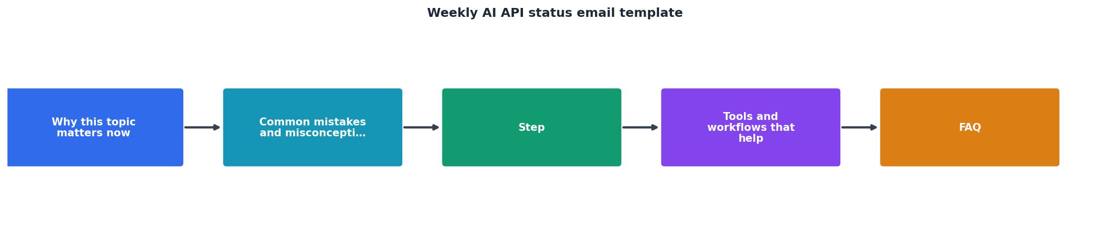
Follow these steps to go from zero to a repeatable weekly email in under an hour.
- Choose your data sources. Decide which providers and endpoints you will track. At minimum, cover every model your production code calls. If you use Observinio, navigate to /providers/openrouter or the equivalent provider page and confirm your endpoints are being probed.
- Set your baseline window. Pick a rolling 4-week median as your baseline for "normal" latency. This smooths out one-off spikes and gives you a stable reference point for week-over-week deltas.
- Create the template in your preferred tool. Copy the five sections above into a Google Doc, Notion page, Confluence template, or a Markdown file in your repo. Lock the section headings so authors cannot accidentally delete them.
- Assign an owner and a send schedule. One person should be responsible for filling in the template each week. Monday morning (09:00 UTC) works well because it covers the full prior calendar week including weekend traffic patterns. Rotate ownership monthly to spread knowledge.
- Pull the data. Export or screenshot the relevant latency charts. If you use Observinio, the platform's weekly summary email already contains p50/p95 per region, you can copy those numbers directly into your template instead of querying raw logs.
- Write the executive summary last. After filling in Sections 2–5, you will have a clear picture of the week. Summarize it in three sentences at the top.
- Send and archive. Send to your distribution list and archive the email (or commit the Markdown file) so it is searchable later. Link to it from your incident channel in Slack or Teams for easy reference.
Automation tips
⚡ Quick automation stack overview
| Tool | Role in workflow | Output |
|---|---|---|
| Observinio | Collects latency probes from 21 regions daily | Weekly summary email with p50/p95 per region |
| Python/Node script | Queries monitoring API, computes percentiles | Markdown or HTML table for Sections 2–4 |
| CI cron job (GitHub Actions) | Runs script every Monday at 08:00 UTC | Draft email or Slack message ready for review |
- Pre-fill with scripts. If your monitoring data lives in an API (as Observinio's does), write a short script that queries the last seven days of probe results, computes the percentiles, and renders them into a Markdown or HTML table. This eliminates manual data entry and copy-paste errors.
- Use conditional formatting. In HTML emails, color-code the Δ column: green for improvements, red for regressions above 10%, gray for changes within noise. Visual cues help scanners spot problems in under five seconds.
- Link to live dashboards. Each provider name in your table should hyperlink to the relevant Observinio status page or your internal Grafana panel so curious readers can drill down without asking you for access.
Common mistakes to avoid
Even with a solid template, teams often stumble on a few recurring issues:
- Skipping weeks when "nothing happened." Consistency builds trust. If you skip a quiet week, recipients will not know whether the silence means "all good" or "we forgot." Send the email every week, even if the summary is "No changes, no incidents."
- Including too many metrics. Resist the urge to dump every percentile, every region, and every endpoint into the email. Highlight the top three to five data points that changed meaningfully. Link to the full dashboard for anyone who wants the deep dive.
- Burying the action items. If action items are hidden in paragraph text, they will be missed. Always use a numbered list at the end with explicit owners and dates.
- Using vague language. "Latency was a bit higher" is not actionable. "OpenRouter gpt-4o p95 increased by 140 ms (+21%) in EU-West" is. Precision builds credibility.
Frequently Asked Questions
Start sending your weekly status email today
A weekly AI API status email is one of the lowest-effort, highest-trust practices a platform team can adopt. The template above gives you a repeatable structure; the step-by-step guide gets you from blank page to first send in under an hour. If you want to skip the manual data gathering, Observinio's weekly summaries and degradation alerts can pre-fill most of the numbers for you, covering 21 regions, multiple providers, and baseline comparisons out of the box. Set it up once, and every Monday your team starts the week knowing exactly where things stand.
Additional Resources
- Best Status Report Template - Ideal for weekly, daily, and monthly status report templates. Helps track progress and stay ahead of the major tasks. The three types of status reports are ...
- Weekly Status Report Template: What to Include and How ... - Use this weekly status report template to share clear progress, owners, risks and decisions fast—and automate updates without losing human ...
- Auto-Generate Weekly Status Reports with Claude API - This tutorial walks you through building a weekly report generator in Python using the Claude API. Dump in a few keywords from your week — ...
Monitor AI API latency from 22 regions
Observinio runs daily probes against OpenRouter and OpenAI endpoints and emails you when latency degrades.
Set up alerts