Regional latency comparison worksheet
When your LLM-powered feature feels snappy in US-East but sluggish in Frankfurt, the problem is rarely the model itself, it is the network path between your user and the inference endpoint. A regional latency comparison worksheet gives you a structured, repeatable way to capture those differences, compare providers side by side, and make routing decisions backed by real numbers instead of gut feeling. This resource walks you through building that worksheet from scratch, filling it with meaningful data, and turning the results into actionable infrastructure changes.

Photo by Atypeek Dgn from Pexels
When your LLM-powered feature feels snappy in US-East but sluggish in Frankfurt, the problem is rarely the model itself, it is the network path between your user and the inference endpoint. A regional latency comparison worksheet gives you a structured, repeatable way to capture those differences, compare providers side by side, and make routing decisions backed by real numbers instead of gut feeling. This resource walks you through building that worksheet from scratch, filling it with meaningful data, and turning the results into actionable infrastructure changes.
TL;DR
- A regional latency worksheet captures TTFB, TTFT, and total response time across every region your users occupy.
- You need at least seven days of probe data to account for daily traffic patterns and provider maintenance windows.
- Comparing OpenRouter relay latency against direct OpenAI endpoints reveals whether the routing layer adds meaningful overhead in each region.
- Observinio's 21-region daily probes can pre-populate most of the worksheet automatically.
- The finished worksheet becomes the evidence base for provider selection, region-specific routing rules, and SLO definitions.
Why a worksheet beats a dashboard for regional comparison

Dashboards are great for real-time triage, but they compress regional nuance into aggregate averages. A P50 latency line that looks healthy globally can hide the fact that your Asia-Pacific users experience twice the time-to-first-token compared to users in Virginia. A worksheet forces you to lay out each region as its own row, each metric as its own column, and each provider as its own sheet. That structure makes cross-region and cross-provider comparisons impossible to miss.
There are three concrete advantages a worksheet provides over a standard monitoring dashboard:
- Snapshot comparability. You freeze a specific time window, say, the last seven days, and compare apples to apples. Dashboards scroll; worksheets stay still.
- Annotation space. You can note that the Singapore spike on Tuesday coincided with an OpenRouter incident, or that the São Paulo improvement followed a CDN change. Context lives next to the data.
- Stakeholder portability. A worksheet exports to PDF or a shared spreadsheet. Product managers, finance teams, and leadership can review it without VPN access to your Grafana instance.
Key metrics to include in every row
Not every latency number tells the same story. Your worksheet should capture at least the following metrics for each region-provider combination:
- TTFB (Time to First Byte): The interval between sending the HTTP request and receiving the first byte of the response. This reflects network round-trip time plus server queue time. It is the single best indicator of how "instant" a chat completion feels to the end user.
- TTFT (Time to First Token): Specific to streaming LLM responses, TTFT measures when the first generated token arrives. It includes TTFB plus any model warm-up or prompt processing time. For conversational UIs, TTFT under 800 ms is the threshold where users perceive the response as immediate.
- P50 and P95 total response time: The median tells you the typical experience; the 95th percentile tells you the worst experience that still affects one in twenty requests. Both matter for SLO definitions.
- Error rate (%): A region with low latency but a 3% error rate is not actually performing well. Include this column to avoid misleading conclusions.
- Probe count: Record how many measurements underlie each cell. A P95 calculated from twelve probes is noise; a P95 from two thousand probes is signal.
"The data comes from continuous network monitoring across Azure's global infrastructure and represents real-world performance measurements.">, Azure network round
This principle applies equally to AI API monitoring. Continuous, automated probes from geographically distributed points produce the kind of data your worksheet needs. Sporadic manual curl tests from your laptop do not.
Choosing your regions and providers

Start with your actual user distribution, not a theoretical list of every cloud region. Pull analytics data to identify the top five to ten cities or regions where your traffic originates. Then map each city to the nearest probe location available in your monitoring tool.
Recommended region shortlist for most SaaS products
| Priority | Region | Why it matters |
|---|---|---|
| 1 | US-East (Virginia) | Largest concentration of AI API endpoints and users |
| 2 | US-West (Oregon / California) | Second-largest US traffic source, different backbone path |
| 3 | EU-West (Ireland / Frankfurt) | GDPR-relevant, major European user base |
| 4 | EU-Central (Netherlands / Germany) | Covers Central European latency profile |
| 5 | Asia-Pacific Southeast (Singapore) | Gateway to Southeast Asian traffic |
| 6 | Asia-Pacific Northeast (Tokyo) | Covers Japan and Korea, often underserved by AI providers |
| 7 | South America (São Paulo) | Highest latency variance due to limited local PoPs |
| 8 | Australia (Sydney) | Geographically isolated, reveals worst-case routing |
Step-by-step: building and filling the worksheet
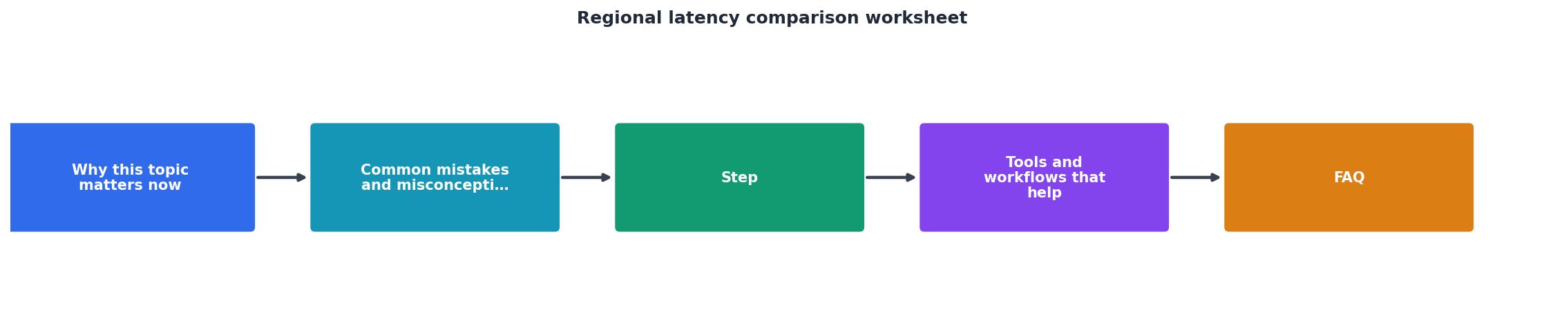
Follow these steps to go from an empty spreadsheet to a completed comparison artifact.
Step 1, Create the template
Open a new spreadsheet or Markdown table. Set up columns in this order:
- Region (e.g.,
us-east-1,eu-west-1) - Provider (e.g., OpenAI Direct, OpenRouter)
- Model (e.g.,
gpt-4o,claude-sonnet-4) - TTFB P50 (ms)
- TTFB P95 (ms)
- TTFT P50 (ms)
- TTFT P95 (ms)
- Total response P50 (ms)
- Total response P95 (ms)
- Error rate (%)
- Probe count
- Date range
- Notes
Step 2, Collect baseline data
Run probes for a minimum of seven calendar days. This captures weekday peak traffic, weekend lulls, and at least one provider maintenance window. If you use Observinio, navigate to /status and export the regional breakdown for your chosen date range. The platform probes 21 regions daily, so most rows will auto-populate.
If you are collecting data manually, use a consistent probe script. Send identical requests, same model, same prompt length, same max-token setting, from each region. Vary nothing except the origin location.
Step 3, Normalize and validate
Before comparing, check for outliers. A single 12-second response in a set of 200 ms readings will skew your P95 dramatically. Decide on a policy: either cap outliers at a threshold (e.g., discard anything above 10 seconds as a timeout) or flag them in the Notes column for manual review.
Validate probe counts. If Singapore only has 30 probes while Virginia has 500, the comparison is uneven. Either extend the collection window for low-count regions or note the confidence difference explicitly.
Step 4, Calculate deltas
Add a derived column: Delta vs. baseline. Pick your lowest-latency region (usually US-East for OpenAI) as the baseline and express every other region's P50 as a difference in milliseconds. This instantly highlights which regions pay the highest latency tax.
For provider comparison, add another derived column: OpenRouter overhead. Calculate it as OpenRouter TTFB P50 − OpenAI Direct TTFB P50 for each region. A consistent 30–40 ms overhead across all regions suggests a fixed relay cost. An overhead that jumps to 200 ms in specific regions points to a routing problem worth investigating.
Step 5, Interpret and act
Use the completed worksheet to answer three questions:
- Which regions need dedicated routing rules? If Asia-Pacific P95 exceeds your SLO, consider deploying a regional proxy or switching to a provider with local inference endpoints.
- Is the OpenRouter relay cost justified? If OpenRouter adds less than 50 ms but gives you model fallback and load balancing, the overhead may be worth it. If it adds 200 ms in your primary region, route critical traffic directly.
- Where should you set alert thresholds? Your worksheet P95 values become natural alert boundaries. If Frankfurt P95 TTFT is normally 650 ms, set a degradation alert at 800 ms to catch regressions before users notice.
Practical checklist: worksheet review cadence
Use this checklist every time you refresh the worksheet, weekly is ideal, monthly is the minimum.
Your progress is saved automatically in your browser.
Common pitfalls when comparing regional latency
Even with a solid worksheet, certain mistakes can lead to wrong conclusions:
Comparing different models across providers
A TTFT comparison between gpt-4o on OpenAI and claude-sonnet-4 on OpenRouter is not a provider comparison, it is a model comparison. Keep the model constant when evaluating provider overhead. Use separate worksheet tabs if you need to compare models.
Ignoring prompt length variation
A 50-token prompt and a 4,000-token prompt produce very different TTFT values. Standardize your probe prompt. A good default is a system message plus a user message totaling roughly 200 tokens, requesting a 100-token completion.
Treating a single bad day as a trend
One Tuesday with elevated latency in Frankfurt does not mean you need to rearchitect your European deployment. Look at the seven-day P95 trend. If the spike is isolated, note it and move on. If it recurs three weeks in a row, escalate.
Forgetting to test during peak hours
Probes that only run at 3 AM UTC will show optimistic numbers. Ensure your probe schedule covers peak traffic windows for each region. Observinio distributes probes throughout the day automatically, which avoids this bias.
Frequently Asked Questions
Start tracking regional latency with real data
Building this worksheet by hand is valuable, but keeping it current is where most teams stall. Observinio runs daily probes from 21 global regions against OpenRouter and OpenAI endpoints, calculates baseline comparisons automatically, and sends you a weekly summary with exactly the numbers this worksheet needs. Set up degradation alerts to get notified the moment a region crosses your SLO threshold, and check the live status page whenever you need a quick sanity check before diving into the full worksheet.
| Region | Provider | Model | TTFB P50 | TTFB P95 | TTFT P50 | TTFT P95 | Error % | Probes | Delta vs Baseline |
|---|---|---|---|---|---|---|---|---|---|
| us-east-1 | OpenAI Direct | gpt-4o | — | — | — | — | — | — | baseline |
| eu-west-1 | OpenAI Direct | gpt-4o | — | — | — | — | — | — | — |
| ap-southeast-1 | OpenRouter | gpt-4o | — | — | — | — | — | — | — |
| sa-east-1 | OpenRouter | gpt-4o | — | — | — | — | — | — | — |
Additional Resources
- Azure network round-trip latency statistics - This article provides round-trip latency statistics between Azure regions to help you optimize your cloud architecture and deployment decisions.
- A question about inter-region latency. - According to this blog post from concurrencylabs the latency per region can differ ...
- AWS inter-region latency chart - AWS inter-region latency chart ・ slightly lower, and 2, more consistent between regions. what the lowest possible latency between the regions ...
Monitor AI API latency from 22 regions
Observinio runs daily probes against OpenRouter and OpenAI endpoints and emails you when latency degrades.
Set up alerts