21-region probe coverage map
When your LLM-powered feature serves users across four continents, a single aggregate latency number is almost meaningless. A chat completion that resolves in 180 ms from Virginia can easily take 600 ms from Mumbai, and your global P95 will hide both extremes. Observinio addresses this blind spot by running daily synthetic probes from 21 distinct cloud regions, giving you a coverage map that turns vague "it feels slow" reports into precise, region-level evidence.

Photo by MART PRODUCTION from Pexels
When your LLM-powered feature serves users across four continents, a single aggregate latency number is almost meaningless. A chat completion that resolves in 180 ms from Virginia can easily take 600 ms from Mumbai, and your global P95 will hide both extremes. Observinio addresses this blind spot by running daily synthetic probes from 21 distinct cloud regions, giving you a coverage map that turns vague "it feels slow" reports into precise, region-level evidence.
TL;DR
- Observinio probes AI API endpoints (OpenRouter, OpenAI direct) from 21 cloud regions every day.
- Each probe measures TTFB, TTFT, and full completion time, then compares results against a rolling baseline.
- The coverage map lets you spot regional degradation in seconds, no custom instrumentation required.
- Alerts fire when a region's latency deviates beyond your configured threshold, so you know before users complain.
- Weekly summary emails give you trend data to inform provider selection and routing decisions.
Why a Single-Region Probe Is Not Enough
Most teams start monitoring AI APIs from wherever their backend happens to run, typically us-east-1 or eu-west-1. That single vantage point answers one question: "Is the API reachable from my server?" It does not answer the questions that actually matter for user experience:
- Is the provider slower in Asia-Pacific this week? A routing change at the provider level can add 100+ ms to TTFB for Tokyo or Sydney without affecting US East at all.
- Did the last model update regress latency in specific regions? Model weight rebalancing across inference clusters often hits some regions before others.
- Is my OpenRouter path faster than direct OpenAI from São Paulo? Without probes in South America, you are guessing.
How the 21-Region Map Is Structured

Observinio distributes probes across major cloud availability zones to mirror real-world user traffic. The 21 regions span six continents and include both primary data-center hubs and secondary locations where latency surprises are most common.
Region Breakdown
| Continent | Example Regions | Why They Matter |
|---|---|---|
| North America | US East (Virginia), US West (Oregon), Canada Central | Closest to most LLM inference clusters; establishes your lowest-latency baseline. |
| Europe | EU West (Ireland), EU Central (Frankfurt), EU North (Stockholm), UK South (London) | GDPR-relevant traffic; Frankfurt often routes differently than Ireland for OpenAI. |
| Asia-Pacific | AP Southeast (Singapore), AP South (Mumbai), AP Northeast (Tokyo, Seoul), AP East (Hong Kong), Australia East (Sydney) | Highest variance region group; routing hops and peering differences create wide TTFB spreads. |
| South America | Brazil South (São Paulo) | Underserved by most providers; latency here is often 2–3× the US baseline. |
| Middle East & Africa | UAE North (Dubai), South Africa North (Johannesburg) | Emerging markets with growing AI adoption; sparse peering means unpredictable latency. |
Each probe sends a standardized chat completion request, same model, same prompt length, same token limit, so that the only variable is the network path and provider-side processing from that region.
"The map includes separate layers for each carrier's broadband and voice coverage.">, Mobile LTE Coverage Map
The same layered-map principle applies here: Observinio separates results by provider (OpenRouter vs. OpenAI direct), by model, and by region, so you can drill into exactly the layer you need.
What Each Probe Measures

Every daily probe captures three core timing metrics:
- TTFB (Time to First Byte): The interval from request dispatch to the first byte of the HTTP response. This reflects DNS resolution, TCP/TLS handshake, and provider queue time.
- TTFT (Time to First Token): The interval from request dispatch to the first streamed token of the model's completion. This is the metric your users actually feel, it is the "thinking" delay before text starts appearing.
- Total Completion Time: The wall-clock duration from request to the final token. Useful for batch workloads and cost-per-second calculations.
Metrics You Can Derive
- Regional spread: Max region TTFT minus min region TTFT. A spread above 400 ms usually signals a routing or peering issue worth investigating.
- Continent-level P50 and P95: Group regions by continent to see if degradation is isolated or widespread.
- Provider delta: For the same region, compare OpenRouter TTFT against direct OpenAI TTFT to quantify the routing overhead.
Step-by-Step: Reading and Acting on the Coverage Map
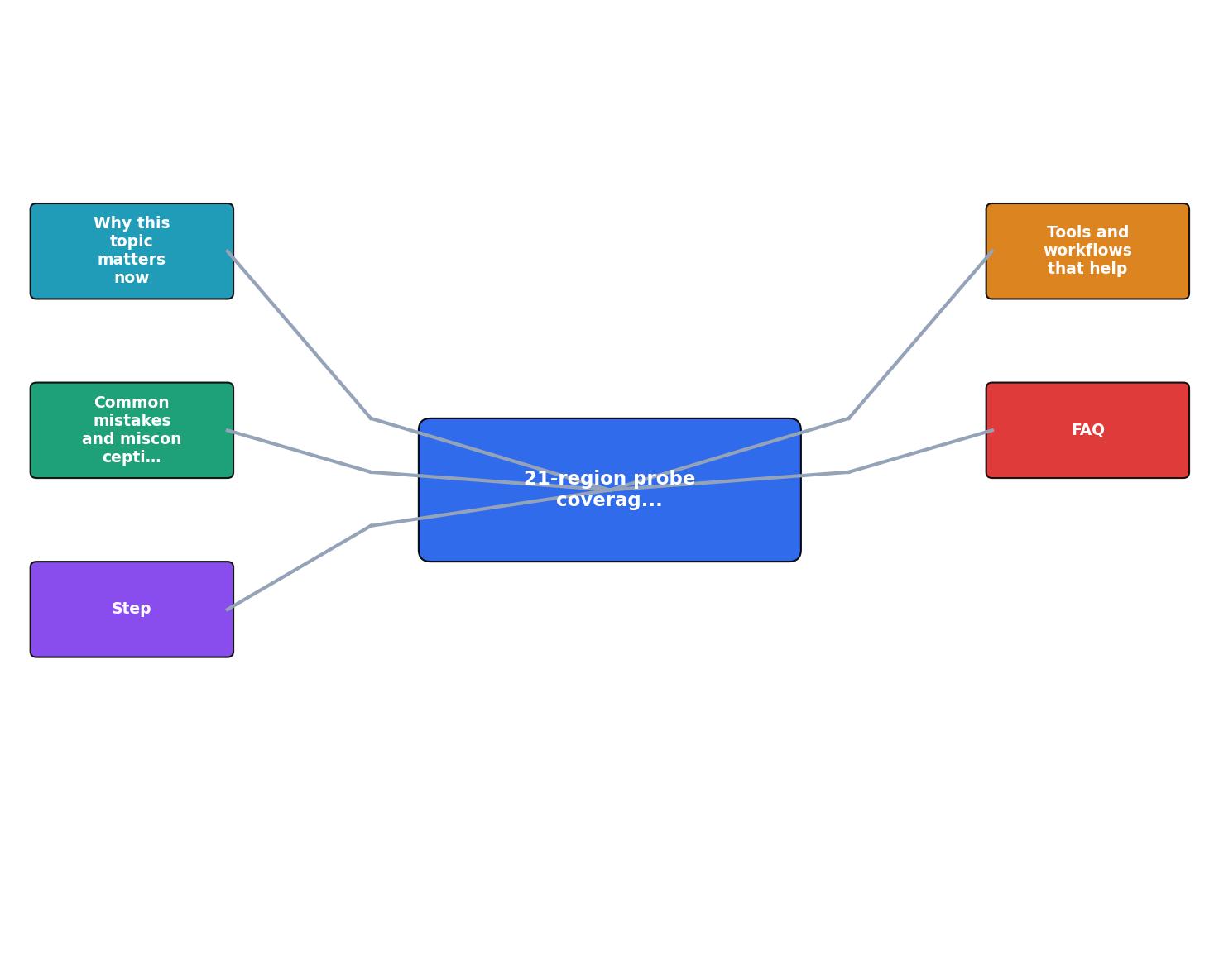
Follow this workflow to turn raw probe data into operational decisions:
- Open the Observinio status page at /status. The map view shows all 21 regions color-coded: green (within baseline), yellow (elevated), red (degraded).
- Identify red or yellow regions. Click any region marker to see the exact TTFB, TTFT, and total completion time from the latest probe, alongside the 14-day baseline.
- Check the provider layer. Toggle between OpenRouter and OpenAI direct to determine whether the degradation is provider-specific or network-wide. If only OpenRouter is red in
ap-southeast-1but direct OpenAI is green, the issue is likely in the routing layer. - Review the weekly summary email. Every Monday, Observinio sends a digest with the top three regions that improved and the top three that degraded. Use this to spot slow-moving trends that daily checks might miss.
- Adjust your routing or alerting. If São Paulo consistently shows TTFT above 500 ms on OpenRouter but stays under 350 ms on direct OpenAI, update your model router to prefer the direct endpoint for South American traffic.
- Set region-specific alert thresholds. Navigate to /providers/openrouter or the equivalent OpenAI page, select the regions your users care about most, and configure email alerts with custom deviation percentages.
Quick Checklist: Coverage Map Health Review
Your progress is saved automatically in your browser.
Practical Example: Diagnosing a Tokyo Slowdown
Suppose your on-call engineer receives a Slack message: "Chat responses are slow for our Japan users." Without regional probes, the investigation starts with guesswork. With the 21-region map, the engineer opens /status and immediately sees:
- Tokyo (ap-northeast-1): TTFT 620 ms (baseline 210 ms), red.
- Seoul (ap-northeast-2): TTFT 580 ms (baseline 230 ms), red.
- Singapore (ap-southeast-1): TTFT 240 ms (baseline 220 ms), green.
Total investigation time: under two minutes, with no custom tracing required.
Frequently Asked Questions
5 regions
● Baseline OK
4 regions
● Baseline OK
7 regions
● Elevated
2 regions
● Degraded
3 regions
● Elevated
Start Using Regional Latency Data Today
If you are tired of debugging "it's slow somewhere" without knowing where, the 21-region coverage map gives you the specificity you need. Observinio's daily probes, baseline comparisons, and email alerts turn regional latency from a mystery into a metric. Visit /status to see the live map, or configure your first degradation alert at /providers/openrouter, setup takes less than five minutes.
Additional Resources
- Mobile LTE Coverage Map - This map shows the 4G LTE mobile coverage areas of the nation's four largest mobile wireless carriers: AT&T Mobility, T-Mobile, UScellular, and ...
- Coverage Map - Coverage Map Personal Business Loading map...
- Global Coverage Maps - Use the interactive map below to select a country and view available mobile network operators (MNOs), along with their coverage areas. Country Switzerland.
Monitor AI API latency from 22 regions
Observinio runs daily probes against OpenRouter and OpenAI endpoints and emails you when latency degrades.
Set up alerts