
If your platform team relies on LLM APIs in production, you already know that a single aggregate latency number tells you almost nothing. A weekly latency summary, one that breaks performance down by provider, model, and region, turns vague hunches into defensible engineering decisions. This article walks through why weekly cadence matters, what a useful summary contains, and how to build the habit without adding another dashboard nobody checks.
TL;DR
- Weekly summaries surface slow-burn latency regressions that real-time alerts miss.
- A good summary covers TTFB, TTFT, p50/p95/p99 percentiles, and region-level breakdowns.
- Comparing week-over-week baselines lets you separate provider degradation from your own infrastructure changes.
- Automating the summary with synthetic probes from multiple regions removes manual data-gathering overhead.
- Observinio's weekly email digest delivers exactly this data for OpenRouter and OpenAI endpoints across 21 regions.
Why Weekly? The Case Against Real-Time-Only Monitoring

Real-time dashboards are essential for incident response, but they create a dangerous blind spot: gradual degradation. A provider endpoint that drifts from 220 ms p95 TTFB to 310 ms p95 over three weeks will never fire a threshold alert set at 500 ms. Yet that 40% regression is absolutely visible to end users, especially those in regions already on the slower end of the distribution.
Weekly summaries solve this by compressing seven days of probe data into a single, scannable report. They answer the questions that matter at a planning cadence rather than an incident cadence:
- Is our primary provider getting slower or faster compared to last week?
- Which regions are drifting outside our latency SLO?
- Did a model update or routing change affect tail latency?
- Are we paying for a premium tier that no longer delivers premium performance?
eu-west-1 has been climbing for two consecutive weeks, that is a concrete backlog item, not a vague concern.
Aggregate Averages Hide Regional Pain
Consider a scenario where your global average TTFT for GPT-4o via OpenRouter sits at a comfortable 380 ms. Looks fine. But break it down by region and you might find that ap-southeast-1 is consistently above 600 ms while us-east-1 pulls the average down at 210 ms. Users in Singapore are having a measurably worse experience, and no single-number dashboard will tell you that.
A weekly summary that includes per-region percentile tables makes this pattern impossible to miss. Over consecutive weeks, you can track whether the gap is widening or narrowing, and whether it correlates with provider-side changes or your own deployment topology.
What Belongs in a Weekly Latency Summary

Not every metric deserves a spot in a weekly report. The goal is signal density: enough data to act on, little enough to actually read. Here is a breakdown of the sections that consistently prove useful for platform engineering teams.
Core Metrics Table
Every summary should include at minimum:
- TTFB (Time to First Byte), measures how quickly the provider begins responding. Critical for streaming chat UIs.
- TTFT (Time to First Token), the interval from request dispatch to the first usable token arriving. This is the metric your users actually feel.
- p50, p95, p99 percentiles, medians are comforting; tail latencies are where user complaints live.
- Week-over-week delta, the absolute and percentage change from the previous week for each metric. A +15% jump in p95 TTFT is a signal even if the absolute number is still below your SLO.
- Region breakdown, at minimum, group by continent; ideally, list the five to ten regions where you have meaningful user traffic.
Provider Comparison Section
If you route traffic through OpenRouter and also maintain a direct OpenAI fallback, the summary should compare both paths side by side. This is not about declaring a winner every week, it is about tracking whether the gap between them is stable, growing, or inverting. A week where OpenRouter's p95 TTFB in Europe suddenly exceeds the direct endpoint by 200 ms is worth investigating, even if both are technically within SLO.
Anomaly Highlights
Flag any region-model-provider combination where the week-over-week change exceeds a configurable threshold (e.g., ±20% on p95). These highlights let the reader skip straight to the items that need attention rather than scanning every row in the table.
"Platform engineering teams have access to hundreds of metrics, yet over 40% of platform initiatives cannot demonstrate measurable value within the first year.">, Success Metrics for Platform Engineering Teams
Weekly latency summaries directly address this measurement gap. They provide a concrete, recurring artifact that ties platform work, provider migrations, routing changes, region expansions, to observable latency outcomes.
How to Build Your Weekly Summary Pipeline

You have two paths: build it yourself from raw probe data, or use a service that generates it for you. Below is a step-by-step approach that works in either case.
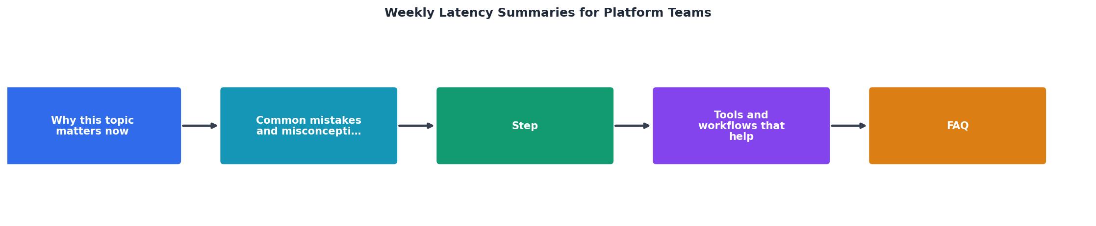
Step-by-Step: From Probes to Inbox
- Establish synthetic probes in every region that matters. You need at least daily probes hitting each provider-model combination from each target region. Observinio runs probes from 21 global regions against OpenRouter and OpenAI direct endpoints, so if you use the platform this step is already handled.
- Store raw latency measurements with full dimensional tags. Every data point should carry: timestamp, region, provider, model, endpoint type (chat completion, embedding, etc.), TTFB, TTFT, and total response time. Without these dimensions, you cannot slice the summary meaningfully.
- Aggregate on a rolling seven-day window. Each Monday morning (or whatever day your team prefers), compute p50, p95, and p99 for each dimension combination over the previous seven days. Store the result as a snapshot so you can compare week-over-week.
- Compute deltas against the prior week's snapshot. For every metric, calculate the absolute change and percentage change. Flag any combination where the delta exceeds your configured threshold.
- Render the summary into a readable format. This could be a Markdown document pushed to a Slack channel, an HTML email, or a page in your internal wiki. The key is that it arrives automatically, no one should have to remember to generate it.
- Distribute to the right audience. Platform engineers, SRE leads, and product managers who own latency-sensitive features should all receive the summary. Keep the distribution list intentional; a report that goes to everyone goes to no one.
- Review in a standing meeting. Dedicate 10–15 minutes in your weekly platform sync to walk through the summary. Assign owners for any flagged anomalies. Track resolution in the following week's summary.
Practical Checklist: Is Your Summary Actually Useful?
Use this checklist to audit your weekly summary after the first month:
Your progress is saved automatically in your browser.
If fewer than six of these boxes are checked, your summary is likely being ignored. Simplify, automate, and focus on the metrics that have actually driven decisions.
Turning Summaries into Engineering Decisions
A summary that sits in an inbox is just data. A summary that changes behavior is an engineering tool. Here are concrete examples of decisions that weekly latency summaries enable:
Provider Routing Adjustments
If your summary shows that OpenRouter's p95 TTFT in eu-central-1 has been 25% higher than the direct OpenAI endpoint for three consecutive weeks, that is strong evidence to shift European traffic to the direct path, or to open a support ticket with OpenRouter armed with specific numbers.
Region Expansion Prioritization
When your summary reveals that ap-south-1 (Mumbai) consistently has the highest tail latency and your analytics show growing user traffic from India, you have a data-backed case for deploying inference infrastructure closer to that region or selecting a provider with better coverage there.
SLO Calibration
Many teams set latency SLOs once and never revisit them. Weekly summaries make it obvious when an SLO is too loose (never breached, so it provides no signal) or too tight (breached every week, so the team stops caring). Reviewing four consecutive weekly summaries gives you enough data to recalibrate with confidence.
Model Migration Validation
After switching from one model version to another, say, moving from GPT-4o to a newer checkpoint, the weekly summary provides a clean before-and-after comparison. If p99 TTFB jumped by 30% in the week after migration, you know exactly where to look.
Common Pitfalls to Avoid
Even well-intentioned summary pipelines can go wrong. Watch out for these patterns:
- Averaging across regions. A global average hides the very regional variance you are trying to detect. Always report per-region data.
- Ignoring tail latency. p50 is the metric that makes you feel good; p99 is the metric that makes your users leave. Include both.
- Manual generation. If someone has to remember to run a script every Monday, the summary will die within a month. Automate it end to end.
- Too many metrics. A 40-row table with 12 columns per row will not get read. Curate ruthlessly. Lead with anomalies, put the full table in an appendix or expandable section.
- No action loop. If the summary never leads to a ticket, a routing change, or a conversation with a provider, it is not providing value. Build an explicit "action items" section into the summary template.
Frequently Asked Questions
Start Getting Weekly Summaries Without Building the Pipeline
If standing up a probe infrastructure across 21 regions, building an aggregation pipeline, and formatting a weekly email sounds like more work than your team can absorb right now, Observinio handles the entire chain. Daily probes against OpenRouter and OpenAI direct endpoints, baseline comparison, degradation alerts, and a weekly summary delivered to your inbox, all without a single line of instrumentation code. Visit the status page to see current latency data, or get in touch to configure alerts tuned to your SLOs.
Ready to receive your first weekly latency summary?
Observinio monitors OpenRouter and OpenAI endpoints from 21 global regions and delivers a formatted digest straight to your inbox every Monday morning, no infrastructure setup required.
Get in touch to configure your digestAdditional Resources
- Success Metrics for Platform Engineering Teams - Reviewed weekly or biweekly by the platform team, driver metrics are system-level signals that help identify bottlenecks before they impact ...
- Is Team Latency Silently Slowing Your Organisation Down? - Team latency isn't just slow meetings, it's a systemic drag that stalls decisions, burns out good people, and silently erodes your competitive edge.
- Agents Don't Wait: How Agent-Based Systems Change Data Latency Requirements - Analytical latency is the delay between an event happening and the data being available for analysis, feeding dashboards, training datasets, and real-time decision engines.