
Photo by Stanislav Kondratiev from Pexels
Public benchmark leaderboards for LLM APIs tell a seductive story: they rank providers by speed, cost, and quality in a single, easy-to-read table. But if you're shipping a chat feature or completion API in production, you've probably discovered a hard truth: those leaderboard numbers rarely match what your users actually experience. A provider that ranks #1 globally might lag in Singapore. A top performer in synthetic tests might stumble under real traffic patterns. And the metrics themselves, often measuring a single region or averaging across many, obscure the latency variance that wrecks user experience.
This article walks you through the gap between published benchmarks and production reality, shows you why that gap exists, and explains how to build a monitoring strategy that reflects what your users actually see.
TL;DR
- Public leaderboards measure synthetic benchmarks in controlled labs, often from a single region or averaged globally, missing regional variance and real-traffic patterns that affect production latency.
- TTFB (Time To First Byte) and TTFT (Time To First Token) vary dramatically by geography, time of day, and provider load, leaderboard averages hide these critical differences.
- Real user latency depends on routing, queue depth, regional provider capacity, and your own stack, none of which appear in public benchmarks.
- Daily synthetic probes from 21 global regions let you measure what users actually see and catch degradation before support tickets arrive.
- Combining leaderboard research with continuous monitoring helps you pick the right provider and detect when they slip.
Why Leaderboards Exist (and Why They're Incomplete)

Benchmark leaderboards serve a real purpose: they aggregate performance data from many LLM providers in one place, making it easier for teams to compare options before committing to a vendor. The most comprehensive ones, like the LLMPerf Leaderboard from Anyscale, run weekly tests across a suite of models and metrics.
"The LLMPerf Leaderboard ranks LLM inference providers based on a suite of key performance metrics and gets updated weekly.">, Comparing LLM performance: Introducing the Open Source Leaderboard for LLM APIs
But here's what leaderboards don't tell you:
- Single-region or averaged perspective. Most leaderboards run probes from one lab or data center. They may average results across regions, but averaging latency is statistically misleading, if 90% of your requests see 200 ms and 10% see 5 seconds, the average looks acceptable even though a tenth of your users suffer.
- Controlled traffic patterns. Leaderboards send requests at a steady, measured pace. Real production traffic is bursty: spikes at certain times of day, traffic patterns that vary by user geography, and competing load from other users of the same provider. A provider that handles 100 req/s smoothly might queue requests when traffic doubles.
- No regional breakdown. A user in Mumbai calling OpenAI direct sees different latency than a user in Frankfurt calling the same endpoint. Leaderboards often report a global average or a single test run, not the distribution across the regions where your actual users sit.
- Synthetic traffic patterns. Benchmark requests are often short, simple prompts designed to test basic performance. Real user requests include longer context, more complex instructions, and varied payload sizes, all of which affect latency.
The Real Latency Metrics That Matter

To monitor real user latency, you need to focus on metrics that actually predict user experience:
Time To First Byte (TTFB)
TTFB is the time from when you send a request to when the API sends back the first byte of the response. For completion APIs, it includes the provider's queueing time and inference setup. TTFB is critical because a user waiting for a chat response to start appearing feels the full weight of this latency.
A leaderboard might report that Provider A has 150 ms average TTFB. But "average" hides distribution: if responses range from 80 ms to 8 seconds, the median is much higher than the mean, and a tenth of requests still timeout. Real user monitoring shows you percentiles, p50, p95, p99, which reveal whether users routinely hit slow requests.
Time To First Token (TTFT)
TTFT specifically measures the time to generate the first token of output. It's a subset of TTFB and matters most for streaming responses where users see tokens appear one by one. A provider with good TTFT makes chat feel responsive even if the full response takes longer.
Regional Variance
The same API endpoint serves different latency to users in different continents. A provider with data centers in US-East and EU-Central might see 120 ms TTFB from New York and 350 ms from Sydney. Leaderboards rarely break this out by region, but your production system needs to know it.
P99 and Tail Latency
Leaderboards often report averages or medians. But the user who hits a p99 latency outlier, a 5-second response when the average is 200 ms, has a broken experience. Focusing only on average latency leaves you blind to the worst-case requests that drive user frustration.
Why Real User Latency Diverges From Benchmarks
Several factors cause production latency to deviate sharply from leaderboard numbers:
1. Queue Depth and Provider Load
Leaderboards send requests at a steady, measured rate. Real production traffic is spiky. During lunch hours, a popular chat app might send 10x the usual load to OpenAI or OpenRouter. Providers queue excess requests, adding latency. A leaderboard measured during low-traffic hours won't catch this.
2. Regional Routing and Network Hops
When you call OpenRouter or a direct API endpoint, the request travels through your infrastructure (auth, logging, routing), then over the internet to the provider's nearest data center. Each hop adds latency. Leaderboard tests often run from a lab co-located with the provider or from a privileged network, skipping real-world routing overhead.
3. Your Own Stack
Your backend's performance affects user latency end-to-end. If your app adds 200 ms to every request (database query, internal validation, response formatting), a provider's 150 ms TTFB becomes a 350 ms user experience. Leaderboards measure only the provider; they can't account for your infrastructure.
4. Time-of-Day Effects
Provider performance fluctuates. OpenAI's inference clusters might be under heavier load at 3 PM PT than at 11 PM, leading to queue buildup and higher latency. Leaderboards running at a fixed time or averaged over a week miss these patterns.
5. Provider Maintenance and Scaling Events
Providers roll out new hardware, move traffic between clusters, and run maintenance. During these windows, latency spikes. A leaderboard from last week won't reflect provider infrastructure changes that happened yesterday.
Building a Real-World Latency Monitoring Strategy
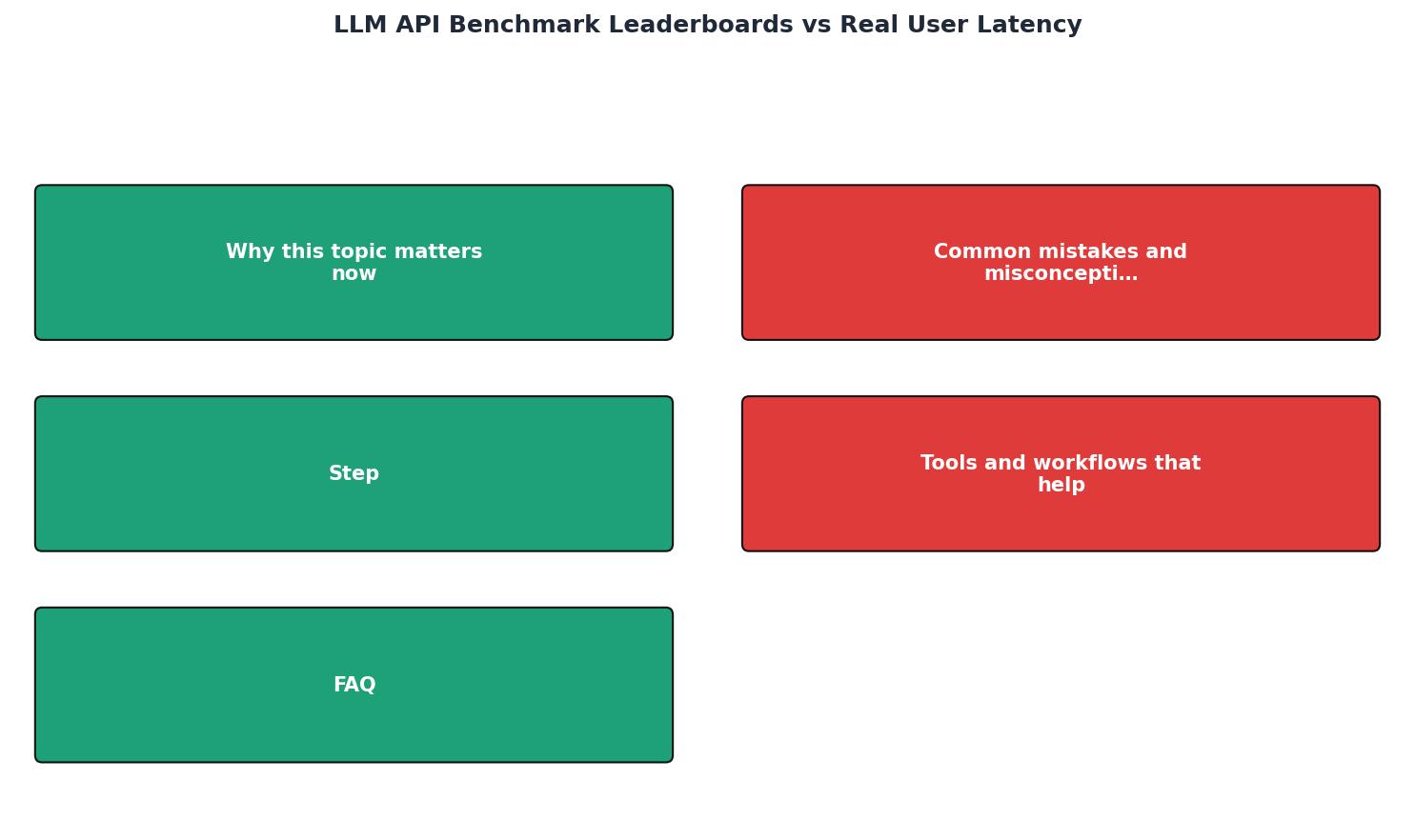
To know what your users actually experience, combine leaderboard research with continuous production monitoring:
Step 1: Use Leaderboards as a Starting Point
Start with public benchmarks to shortlist providers. Look for:- Consistent top performers across multiple metrics. A provider that ranks high on both TTFB and cost is a stronger candidate than one that excels only on speed.
- Transparency about methodology. Leaderboards that explain their test setup, region, and traffic patterns are more trustworthy than opaque rankings.
- Frequent updates. A leaderboard updated weekly or monthly is more useful than one that's months out of date.
Step 2: Set Up Multi-Region Synthetic Probes
Deploy daily probes from your users' actual regions. If your users are in US, Europe, and Asia-Pacific, you need latency data from all three. Observinio monitors from 21 global regions, letting you see latency distribution across the geographies where your traffic actually originates.
Step 3: Measure Against a Baseline
Define what "good" latency looks like for your use case:- Chat completions: p50 TTFB under 250 ms, p95 under 800 ms.
- Long-form generation: p50 TTFB under 500 ms, p95 under 2 seconds.
- Real-time agents: p50 TTFB under 150 ms.
Step 4: Create a Comparison Worksheet
Track latency over time for each provider you're considering:
| Provider | TTFB p50 (US) | TTFB p50 (EU) | TTFB p50 (AP) | Cost/1K tokens | Availability |
|---|---|---|---|---|---|
| OpenAI direct | 180 ms | 320 ms | 580 ms | $0.015 | 99.9% |
| OpenRouter | 200 ms | 280 ms | 420 ms | $0.010 | 99.95% |
| Together AI | 220 ms | 350 ms | 510 ms | $0.008 | 98.5% |
Step 5: Set Up Degradation Alerts
Configure alerts to notify you when:- TTFB climbs above your baseline by 30–50%. A jump from 200 ms to 300 ms warrants investigation.
- A provider's p99 latency exceeds 3 seconds. Tail latency outliers often signal capacity stress.
- Regional variance exceeds expectations. If EU latency is suddenly 2x US latency, a regional event may be affecting the provider.
Real-World Example: When Leaderboards Misled
Consider a platform team that routed all chat traffic through OpenRouter based on a leaderboard showing strong p50 latency and low cost. The leaderboard measured from a single US-based lab. For the team's US users, latency was solid. But when they expanded to Southeast Asia, support tickets flooded in: users complained that responses took 10+ seconds to appear.
Investigation revealed that OpenRouter's routing from Asia-Pacific regions routed through a congested pipeline, adding 3–4 seconds of latency on top of inference time. The leaderboard's single-region test never caught this. By deploying probes from Singapore, Bangkok, and Sydney, the team discovered that a different provider, Together AI, had better regional coverage and lower Asia-Pacific latency by 40%. They added a failover routing rule: if OpenRouter latency exceeds 600 ms from a region, retry with Together.
Without multi-region monitoring, they would have blamed their own infrastructure or suffered user churn. Leaderboards got them 80% of the way; continuous regional monitoring closed the gap.
Checklist: From Leaderboards to Production Confidence
Your progress is saved automatically in your browser.
FAQ
Frequently Asked Questions
Next Steps: Monitor Like Your Users Do
💡 Pro Tip
Don't rely solely on single-region leaderboard data. Multi-region monitoring reveals latency patterns that impact real users across different geographies, helping you catch degradation within 24 hours instead of discovering it through support tickets.
Leaderboards are a helpful starting point, but they measure lab conditions, not production reality. The gap between a leaderboard's average TTFB and your p99 latency from Mumbai can be the difference between a responsive chat feature and support tickets.
To catch latency degradation before your users feel it, set up daily probes from the regions where your traffic originates. Observinio monitors OpenRouter, OpenAI, and other popular endpoints from 21 global regions, sending email alerts when latency spikes or regional variance increases. You'll see the same numbers your users see, not a lab average, and can route traffic or raise escalations before response times hurt engagement.
Visit /status to see real-time latency for major providers, or contact the team to discuss a monitoring setup tailored to your regions and SLOs.
Additional Resources
- LLM & AI Agent Benchmarks vs Reality: Why AI Applications ... - LLM benchmarks don't reflect real-world performance in AI applications and agents. Learn how to evaluate accuracy, latency, and cost to build ...
- Introducing the Open Source Leaderboard for LLM APIs - The LLMPerf Leaderboard ranks LLM inference providers based on a suite of key performance metrics and gets updated weekly. These metrics are ...
- Fastest LLMs by Output and First Answer (September 2026) - Compare current LLM output speed, first-answer latency, price, and quality. Sort the live runtime table, then choose by request length and task success.